YES HELLO
TWIX
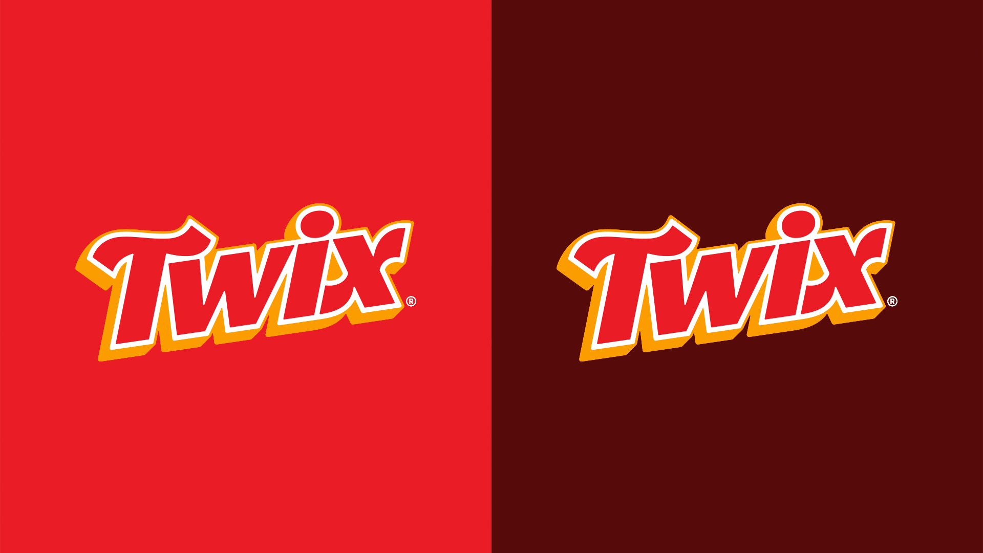
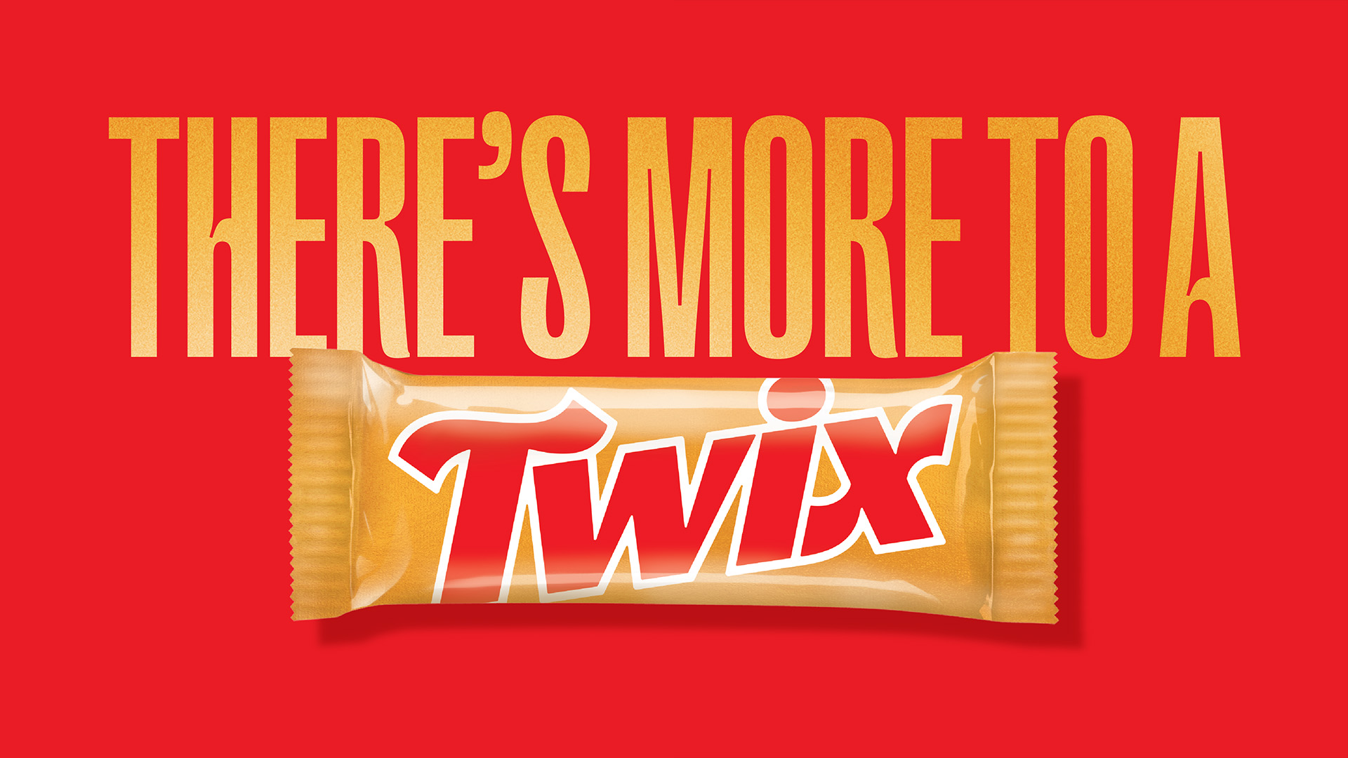
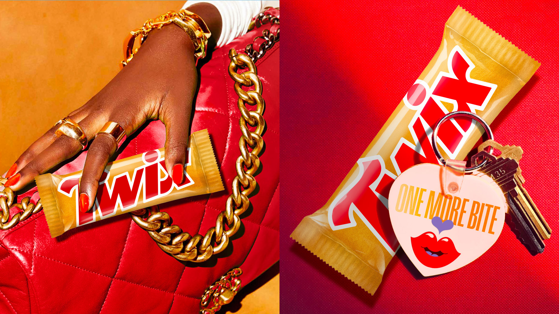
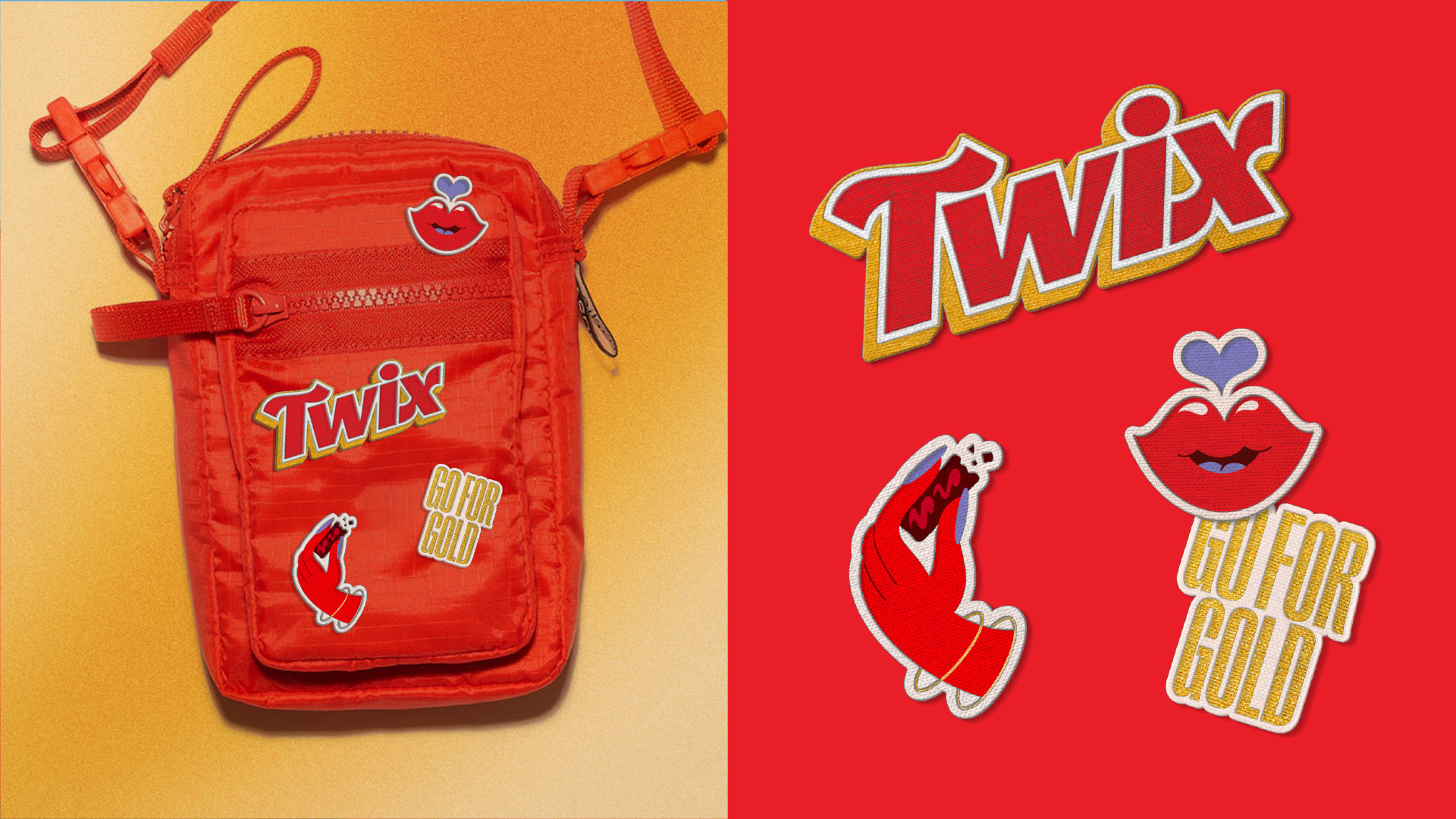
Identity and design direction for Twix aimed to develop a flexible, integrated system that is distinctive to Twix across the consumer journey. The work needed to reflect the new positioning around the overdelivery of delight and abundance is felt throughout the system. The updated mark builds on the legacy of Twix while signaling to the future. It retains the recognizable, angled red outlined typography but introduces more liberated, hand-crafted letterforms.
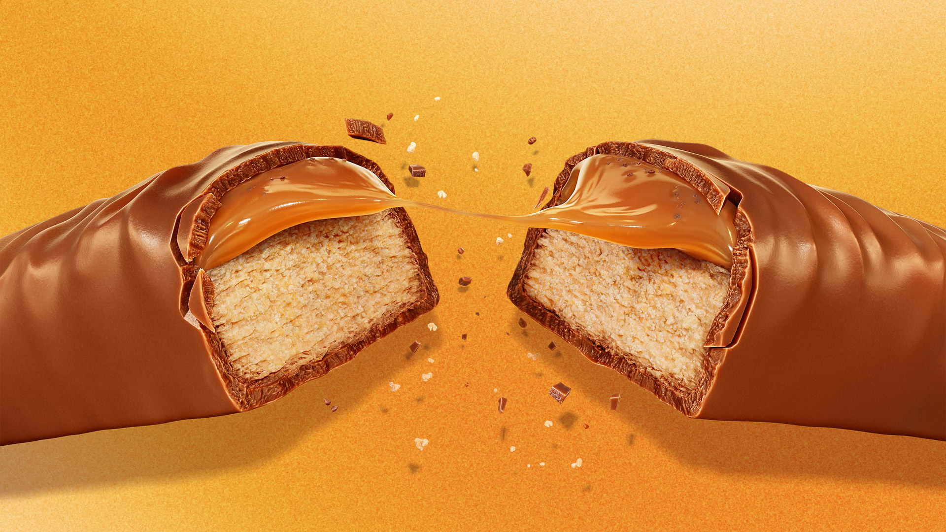
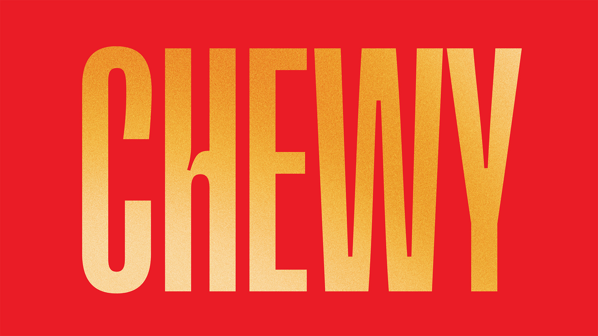
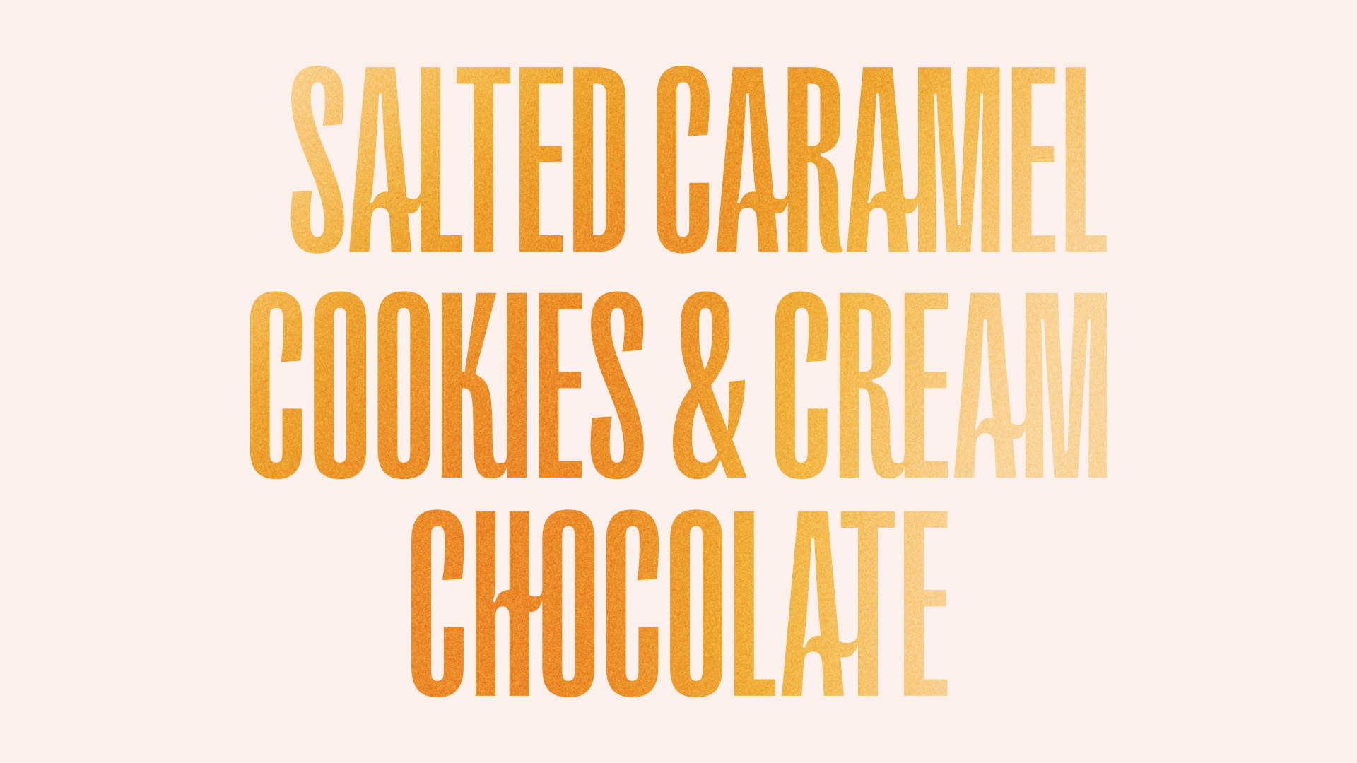
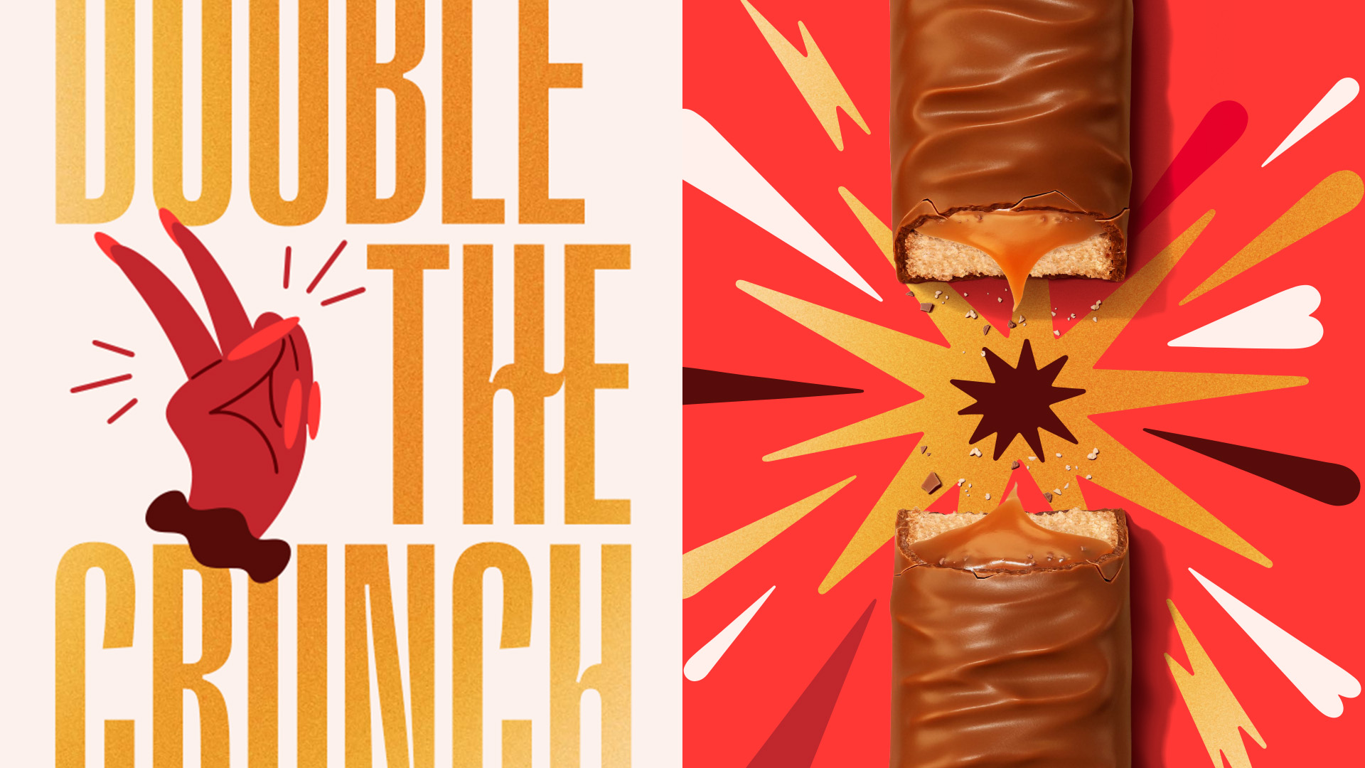
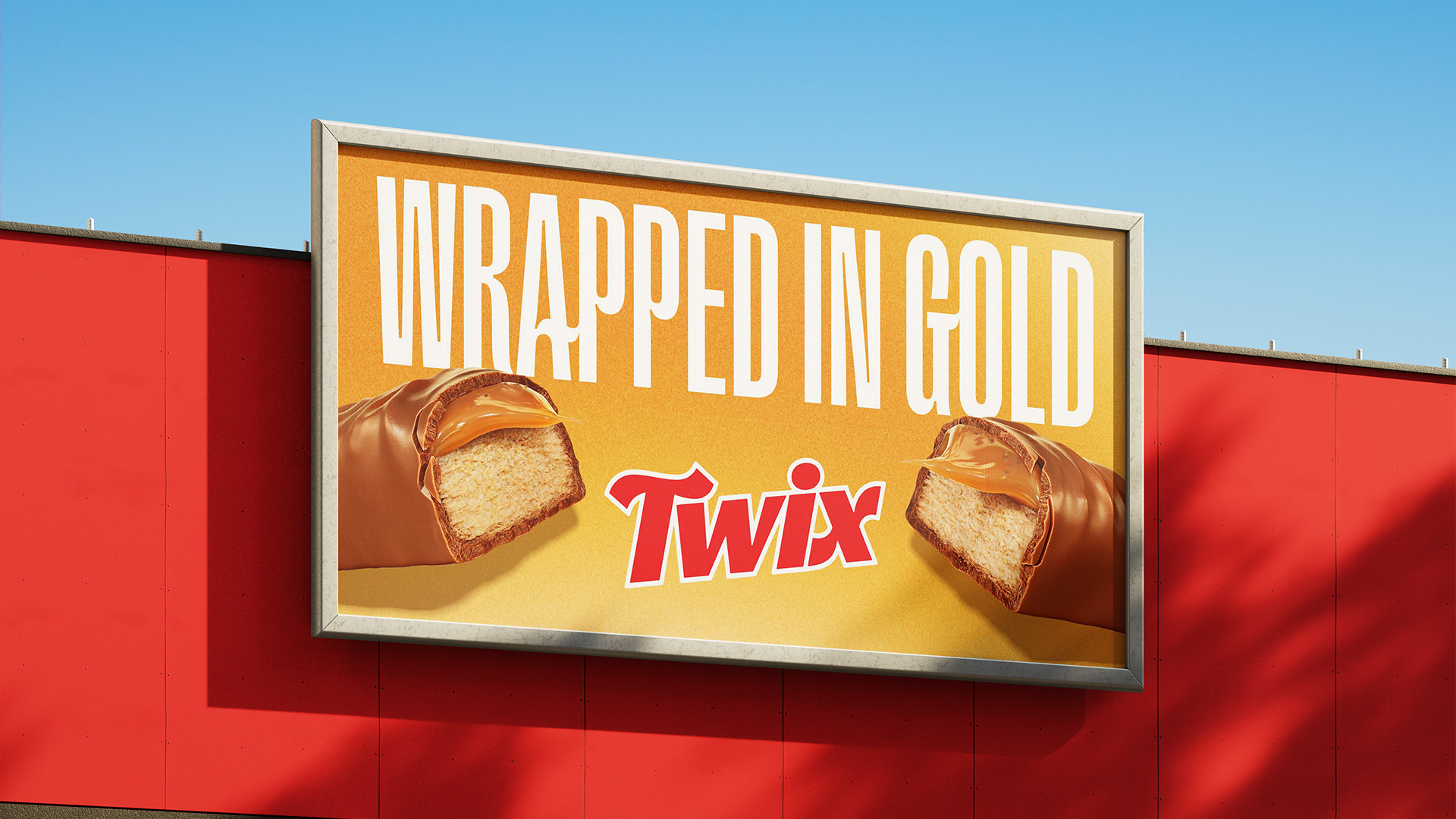
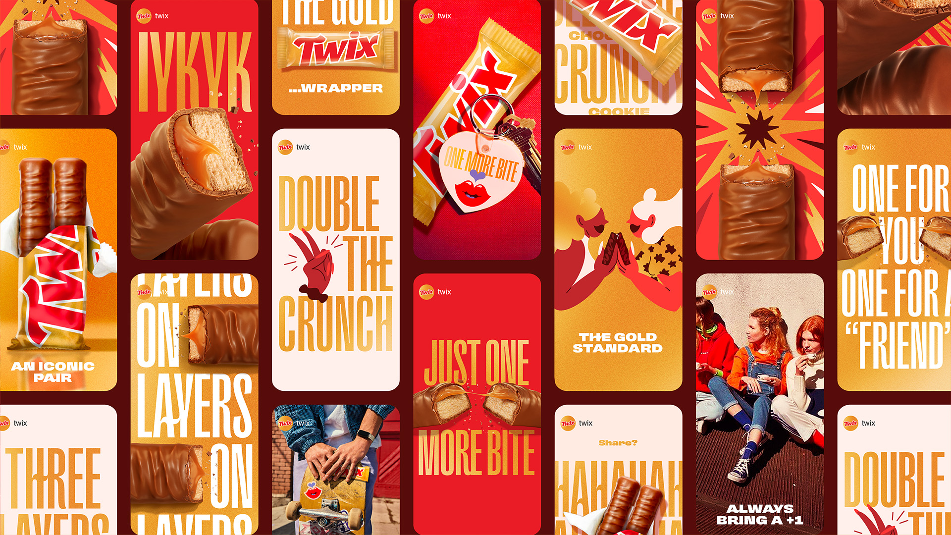
Bespoke typography was introduced to be evocative of the creamy and crunchy quality of the product across a backdrop of a more vibrant and tactile version of the familiar gold, furthering the idea of abundance throughout the system.
Work for Twix featured on Dieline.
Work for Twix featured in Adweek.
